Plotly에서 그래프를 그리는 가장 보편적인 방법은
① 기초 그래프를 생성 후
② 다양한 방법으로 그래프를 업데이트
하는 2단계를 거치는 방법이다.
2장에서는 기초그래프 생성에 대한 내용을 다뤄보았다.
[Python plotly 시각화] 2. Graph Object 와 Plotly Express
이번 3장에서는 그래프 업데이트에 대한 5가지 함수 기능에 대해 알아보자.
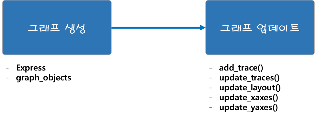
Plotly의 기본 문법과 여러 그래프들은 이 5개 함수를 활용한 Plotly 그래프의 튜닝과정이다.
1. add_trace( )
2. update_trace( )
3. update_layout( )
4. update_xaxes( ) / update_yaxes( )
plotly.graph_objects.Figure — 5.14.1 documentation
’carpet’, ‘choropleth’, ‘choroplethmapbox’, ‘cone’, ‘contour’, ‘contourcarpet’, ‘densitymapbox’, ‘funnel’, ‘funnelarea’, ‘heatmap’, ‘heatmapgl’, ‘histogram’, ‘histogram2d’, ‘histogram2dcontour’, ‘ic
plotly.com
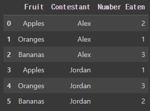
실습 데이터
import pandas as pd

df = pd.DataFrame({
  "Fruit": ["Apples", "Oranges", "Bananas", "Apples", "Oranges", "Bananas"],
  "Contestant": ["Alex", "Alex", "Alex", "Jordan", "Jordan", "Jordan"],
  "Number Eaten": [2, 1, 3, 1, 3, 2],
})
1. add_trace( )
- fig.add_trace( 추가할 Trace )
add_trace( ) 함수는 Figure에 새로운 Trace를 추가할 때 사용한다. (ex. go.Scatter, go.Bar 등)
즉, 하나의 Figure에 여러개의 그래프를 겹쳐 그릴 수 있다.
(1) 예제1 : 빈 Figure에 Trace 추가하기
import plotly.graph_objects as go			# import 시키기
fig = go.Figure()					# Figure 생성

# 막대그래프
for contestant, group in df.groupby('Contestant'):				# 그뤂핑
  fig.add_trace(go.Bar(x=group['Fruit'], y=group['Number Eaten']		# 막대그래프 생성(x,y출 설정)
                       , name = contestant					# 범주 이름 설정
                       , hovertemplate="Contestant=%s<br>Fruit=%%{x}<br>Number Eaten=%%{y}<extra></extra>"% contestant))		# hover 설정

fig.show( )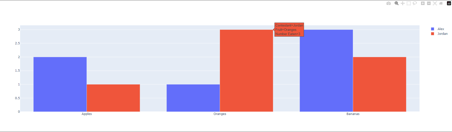
(2) 예제 2 : 이미 Trace가 있는 Figure에 Trace 추가하여 겹쳐 그리기
import plotly.graph_objects as go			# import 시키기
fig = go.Figure()					# Figure 생성

# 막대그래프
for contestant, group in df.groupby('Contestant'):				# 그뤂핑
  fig.add_trace(go.Bar(x=group['Fruit'], y=group['Number Eaten']		# 막대그래프 생성(x,y출 설정)
                       , name = contestant					# 범주 이름 설정
                       , hovertemplate="Contestant=%s<br>Fruit=%%{x}<br>Number Eaten=%%{y}<extra></extra>"% contestant))		# hover 설정

# 임의의 그래프 추가하기
fig.add_trace( go.Scatter(				# Scatter 추가
        x=group['Fruit'], y=group['Number Eaten']
        , mode="lines"				# 선 형식
        , line=go.scatter.Line(color="black")))		# 선색 설정
fig.show( )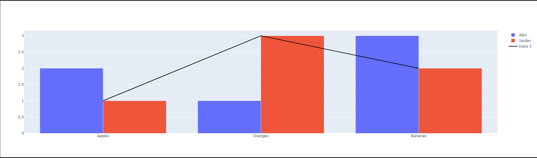
2. update_trace()
- fig.update_trace(업데이트 내용)
update_ trace( )는 이미 생성된 Trace의 Type, 색, 스타일, 템플릿 등 추가 편집을 해주는 함수이다.
처음 Trace를 생성할 떄 스타일을 지정할 수 있지만, update_trace( )는 한번에 모든 Trace의 스타일을 일괄적으로 업데이트가 가능하다.
따라서, 코드의 길이를 줄여 가독성 높은 코드구현이 가능하다.
즉, 'Trace 생성부' 와 'Trace 편집부'를 나눠서 작성 할 수있다.
(1) 예제 :
import plotly.graph_objects as go			# import 시키기
fig = go.Figure()					# Figure 생성

# 막대그래프
for contestant, group in df.groupby('Contestant'):				# 그뤂핑
  fig.add_trace(go.Bar(x=group['Fruit'], y=group['Number Eaten']		# 막대그래프 생성(x,y출 설정)
                       , name = contestant					# 범주 이름 설정
                       , hovertemplate="Contestant=%s<br>Fruit=%%{x}<br>Number Eaten=%%{y}<extra></extra>"% contestant))		# hover 설정

# 임의의 그래프 추가하기
fig.add_trace( go.Scatter(				# Scatter 추가
        x=group['Fruit'], y=group['Number Eaten']
        , mode="lines"					# 선 형식
        , line=go.scatter.Line(color="black")))		# 선색 설정

# 막대 그래프의 색 변경
fig.update_traces(marker=dict(color="orange"),		# 색상 설정
                  selector=dict(type="bar"))		# 변경할 그래프 선택
fig.show( )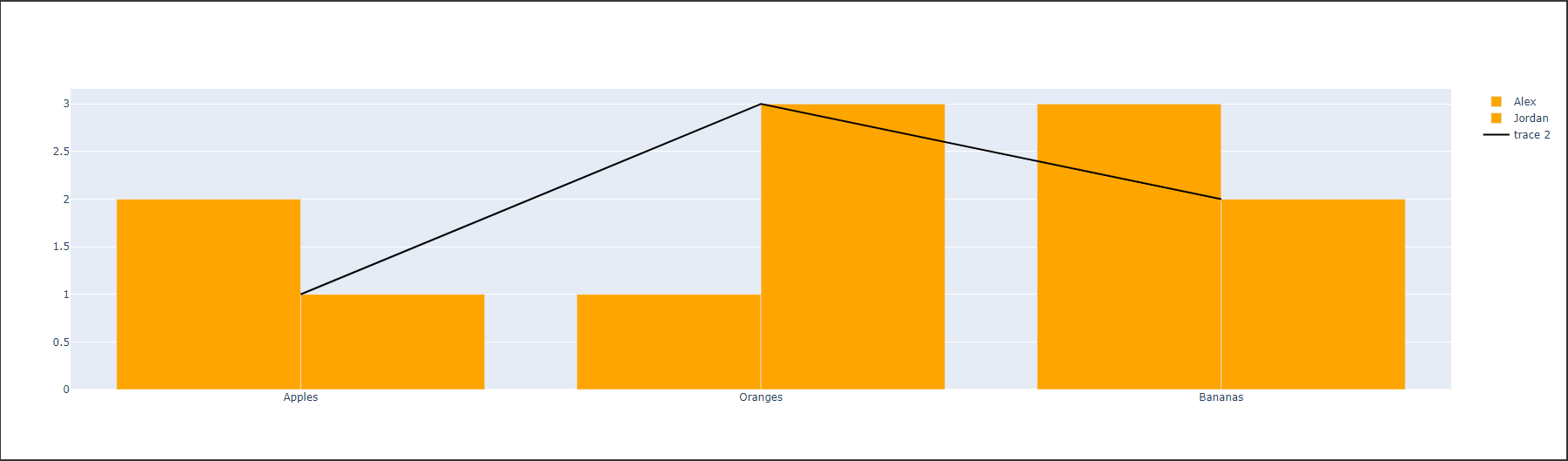
3. update_layout( )
- fig.update_layout(업데이트 내용)
update_layout( )은 그래프의 사이즈, 제목 및 텍스트, 글꼴과 같은 Trace의 외적인 요소를 업데이트 시키는 함수이다.
(1) 예제
import plotly.graph_objects as go			# import 시키기
fig = go.Figure()					# Figure 생성

# 막대그래프
for contestant, group in df.groupby('Contestant'):				# 그뤂핑
  fig.add_trace(go.Bar(x=group['Fruit'], y=group['Number Eaten']		# 막대그래프 생성(x,y출 설정)
                       , name = contestant					# 범주 이름 설정
                       , hovertemplate="Contestant=%s<br>Fruit=%%{x}<br>Number Eaten=%%{y}<extra></extra>"% contestant))		# hover 설정

# Title 추가하기
fig.update_layout(title_text="Fruit Eaten"				# 타이틀 이름
                  , title_font_size=30					# 타이틀 글자 크기
                  , title_font_color="red"				# 타이틀 글자 색
                  , legend_title_text = 'Contestant')			# 범주 이름

fig.show()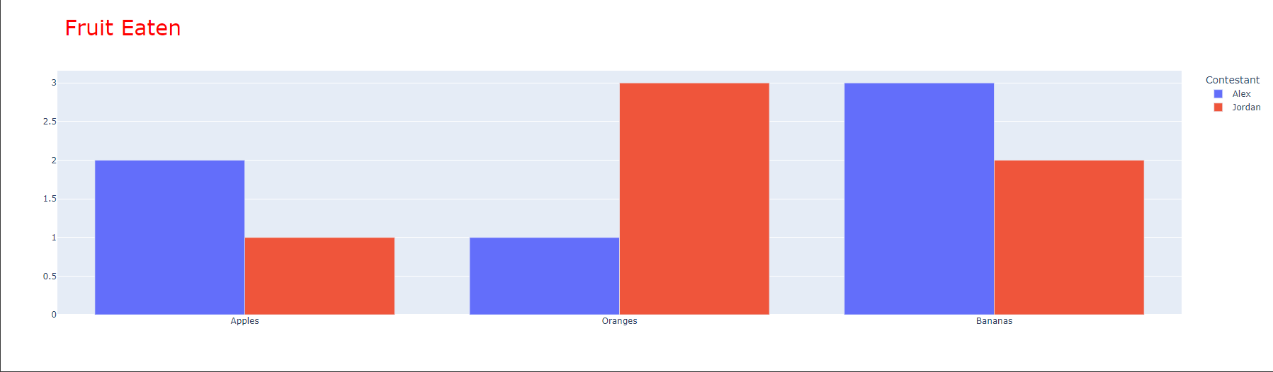
4. update_xaxes() / update_yaxes()
- fig.update_xaxes(업데이트내용)
- fig.update_yaxes(업데이트내용)
fig.update_xaxes(), fig.update_yaxes()는 각각 X, Y축에 관한 축 타이틀, 선 스타일, 그리드 설정 등의 편집이 가능하다.
(1) 예제 : x, y축 타이틀 설정
import plotly.graph_objects as go			# import 시키기
fig = go.Figure()					# Figure 생성

# 막대그래프
for contestant, group in df.groupby('Contestant'):				# 그뤂핑
  fig.add_trace(go.Bar(x=group['Fruit'], y=group['Number Eaten']		# 막대그래프 생성(x,y출 설정)
                       , name = contestant					# 범주 이름 설정
                       , hovertemplate="Contestant=%s<br>Fruit=%%{x}<br>Number Eaten=%%{y}<extra></extra>"% contestant))		# hover 설정

# Title 추가하기
fig.update_layout(title_text="Fruit Eaten"				# 타이틀 이름
                  , title_font_size=30					# 타이틀 글자 크기
                  , title_font_color="red"				# 타이틀 글자 색
                  , legend_title_text = 'Contestant')			# 범주 이름

# X, Y축 타이틀 설정
fig.update_xaxes(title_text = 'Fruit')				# X축 타이틀
fig.update_yaxes(title_text = 'Number Eaten')			# Y축 타이틀

fig.show()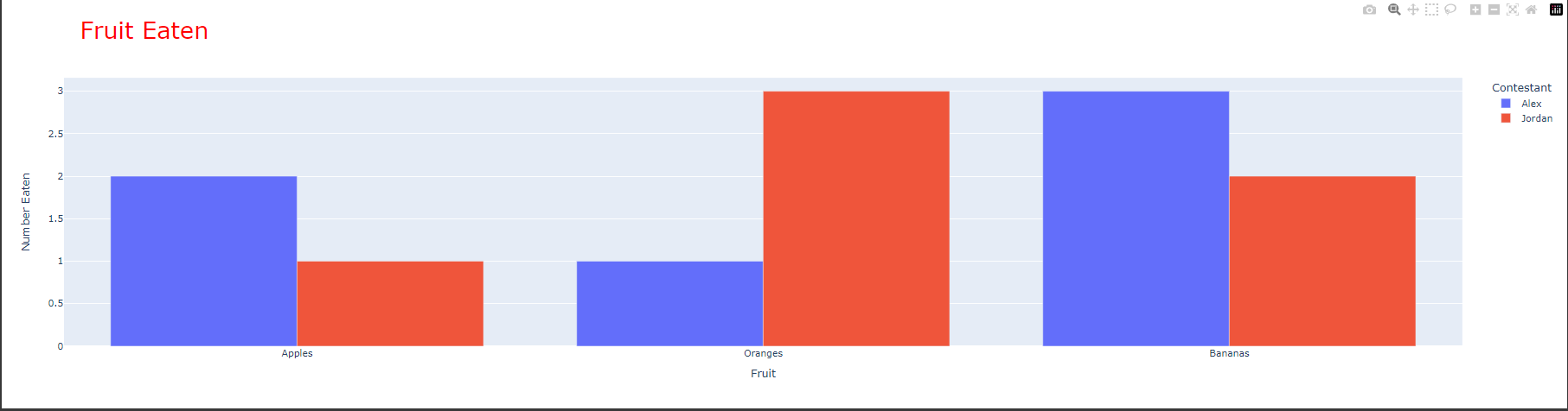
'Python > Plotly' 카테고리의 다른 글
| [Python Ploty 시각화] 4. Plotly 실습 데이터 소개 (4) | 2023.04.18 |
|---|---|
| [Python plotly 시각화] 2. Graph Object 와 Plotly Express (0) | 2023.04.17 |
| [Python Plotly 시각화] 1. Plotly 소개 (0) | 2023.04.17 |